· 6 min read
The Negative as Score: Adams, Print Values, and the Logic of Dodging and Burning
How Ansel Adams treated the negative as a fixed score and the print as performance, holding back and burning in to realize a visualized tonal scale.
Written in by Simon Lehmann Editor
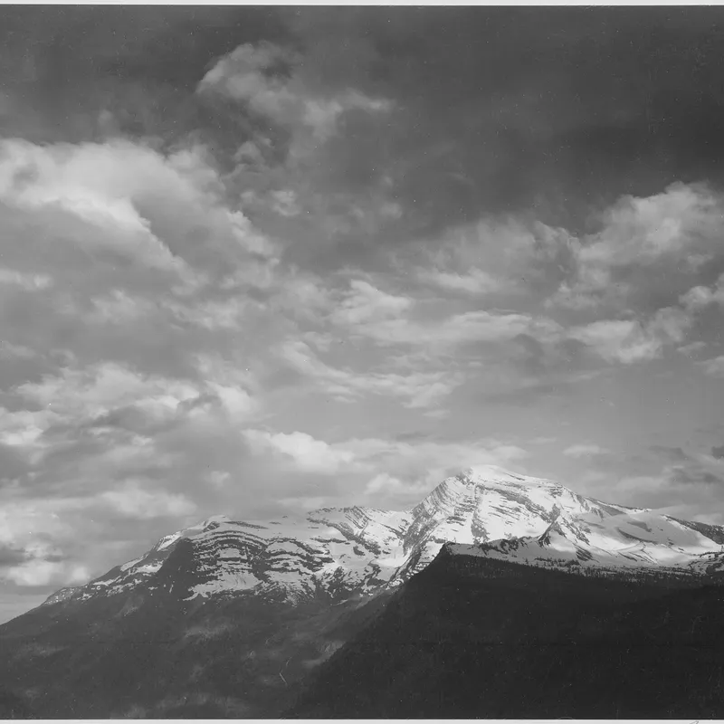
The Group f/64 tradition that Ansel Adams codified treats the negative as a vessel for the full tonal scale: a sharp, deeply detailed rendering from the foreground pebble to the distant peak, with every zone from black to white placed deliberately through the Zone System. Michael Kenna works in the opposite direction. Born in Widnes, Lancashire in 1953 and based in the United States since 1977, he builds quiet images from very little — a row of posts in fog, a single tree on an empty field, a horizon split between two flat tones. The reduction is not stylistic shorthand. It is the product of specific decisions about camera, exposure, development and printing, each one removing information until only the essential marks remain.
Kenna switched to a Hasselblad in 1986, after roughly fifteen years working on 35mm Nikkormats and Nikons, and has shot the 6cm square format — two and a quarter inches, in his own phrase — ever since. He carries five lenses between 40mm and 250mm, but the constant is the square itself. The square removes the directional bias of the rectangle: there is no long axis pulling the eye left or right, so a subject placed against open space sits in stable, deliberate isolation. Negative space becomes the dominant element. A small dark form — a tree, a pier, a bench — reads as a single mark on a large neutral field, much as a brushstroke reads on paper. Because the square refuses the panoramic sweep, it suppresses the impulse to catalogue a scene and instead isolates one relationship between figure and ground.
The long exposure is Kenna’s tool for removing detail rather than recording it. On his own technical FAQ (michaelkenna.net) he describes night exposures running from “one or two seconds to seven or eight hours,” with the typical exposure between ten and thirty minutes. The mechanism that makes those durations possible is reciprocity-law failure. Film assumes that halving the light and doubling the time yields the same density, but below a certain illumination the emulsion loses sensitivity, so the time the meter calls for and the time the shutter actually needs diverge sharply.
For Kodak Tri-X the divergence begins at roughly one second of metered exposure; below that, no correction is needed. Above it, the correction grows steeply. Working from Kodak’s reciprocity data — its datasheet F-4017 and the long-exposure curve, with a P-factor of 1.54 for metered times of fifty seconds and longer — a metered one minute needs about nine minutes ten seconds of actual exposure, and a metered one minute forty seconds needs roughly twenty minutes. A dusk meter reading of “thirty seconds at f/8,” pushed past the reciprocity threshold by stopping down or waiting for the light to drop, is exactly how a Kenna scene becomes a twenty-minute clock time on the cable release.
That long clock time is what does the subtraction. Anything moving averages out: water loses its ripples and flattens to a smooth grey plane, drifting cloud smears into a continuous gradient, passing light leaves a soft trace or none at all. What survives is only what stays still long enough to register — the fixed structures of the landscape, concentrated into a small set of stable tones.
For night work Kenna shoots Kodak Tri-X 400 in medium format. For long daytime exposures he uses Agfa 25 ASA film behind a neutral-density filter, holding the shutter open up to thirty minutes depending on the light, so a bright scene can be rendered with the same smeared water and emptied sky as a night one.
Development is a single routine for everything: D-76 diluted 1:1, eleven and a half minutes at 68 F (20 C). D-76 is Kodak’s metol-hydroquinone fine-grain developer, introduced in 1927; 20 C is its standard reference temperature, and the 1:1 dilution means one part stock to one part water used one-shot, trading a slightly longer time for marginally more apparent sharpness. When D-76 is unavailable he substitutes Rodinal. The fixed time is deliberate: rather than tailor development to each negative, Kenna, in his own words, “works out any adjustments at the printing stage.” Reciprocity failure also lowers contrast at long durations, and instead of correcting that with reduced development he absorbs the contrast shift under the enlarger. Exposure, development and printing are one chain, and he chooses to keep the middle link constant.
The final object is small. Kenna prints on 8x10 Ilford Multigrade paper, the image roughly seven and a half inches square, developed in Ilford Universal print developer and enlarged on a Beseler with Schneider-Kreuznach 50mm, 80mm and 135mm lenses. Every print since 1982 belongs to a strict edition of 45 plus four artist’s proofs, and he typically pulls ten to fifteen prints from a negative once he has arrived at the first acceptable one. The modest scale is a stated choice, not a constraint: a large print invites the eye to roam and inspect, while a small one is taken in almost at a glance, as a single composed mark drawing the viewer close.
Each print is sepia-toned silver gelatin, toned by hand; some older work was both sepia and selenium toned. Sulphide toning is a two-stage indirect process — the metallic silver image is first bleached back to a silver halide, then redeveloped and converted to silver sulphide. The highlights, carrying the least silver, convert first, which is why toning warms the lighter values most. Silver sulphide is also chemically more stable than metallic silver, so the toning buys archival permanence as well as warmth: it is a preservation decision as much as an aesthetic one. The finished prints are dry-mounted and matted on 16x20 inch white museum board.
Camera, film, exposure, development and print thus work as one system — each step discarding information until the landscape is distilled to a few essential tones.
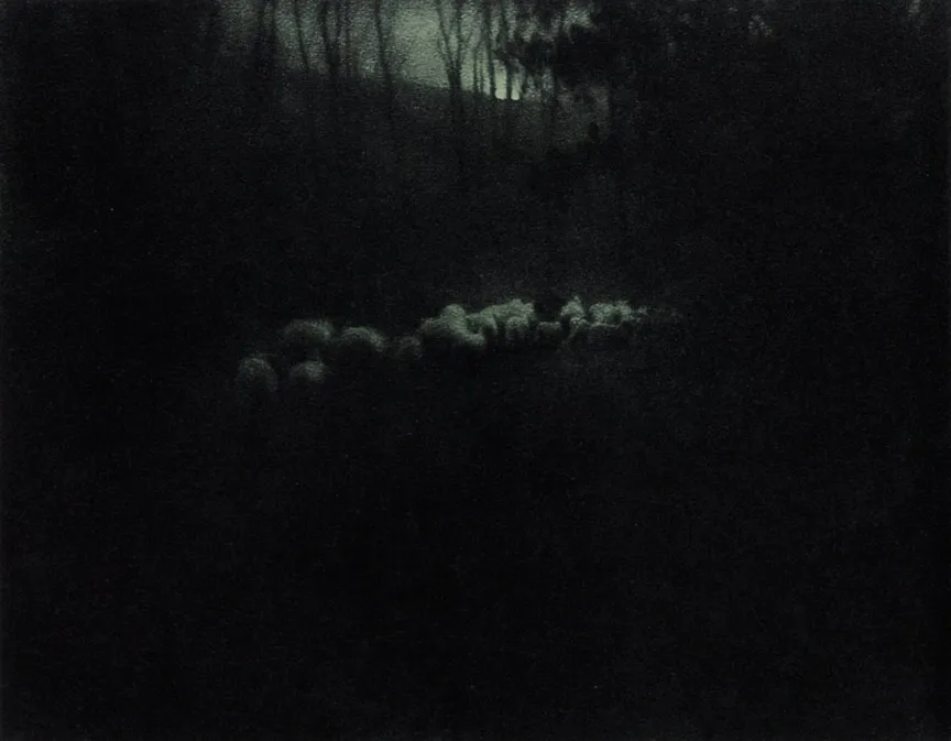
Image: Edward Steichen, Pastoral—Moonlight (1907), published in Camera Work No. 20, public domain
· 6 min read
How Ansel Adams treated the negative as a fixed score and the print as performance, holding back and burning in to realize a visualized tonal scale.

· 6 min read
How Bill Brandt traded tonal fidelity for stark blacks, bleached whites, and the steep distortion of a wide-angle police camera.
· 8 min read
How Cartier-Bresson fused timing with internal geometry, composing the full 35mm frame in the viewfinder and printing uncropped, with the Leica as a discreet tool.
The grainmag companion app
Meter and place your tones without a signal. No account, no internet required — just you, the light, and the grain.